Visit coache.gse.harvard.edu for more partner resources.
© Copyright 2020, The President & Fellows of Harvard College
These charts summarize the benchmark results for your institution relative to your selected comparison institutions and the entire cohort of participating institutions.
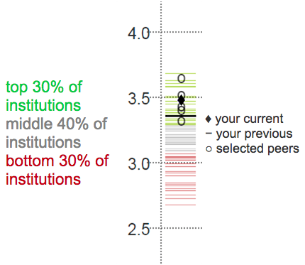
Each column represents the range of institutional means (not the distribution of individual respondents) along that dimension. Within each chart, you can see your institution's mean score on the benchmark ( ◆ ), your institution's prior mean score ( — ), the mean scores of your five selected comparison institutions ( o ), and the distribution of the responses of the entire cohort as signified by the red, grey, and green lines.
You should be most concerned with the placement of your marker ( ◆ ). A score in the red section of the column indicates that your institution ranked in the bottom 30 percent of all institutions. A mark in the green section indicates your faculty rated a benchmark in the top 30 percent of all institutions. A mark in the grey area indicates a "middle-of-the-road" result.
This combination of your cohort comparison and rank relative to your selected comparison institutions establishes the threshold COACHE uses to identify areas of strength and areas of concern.
An area of strength is identified as any benchmark or survey item where your score is in the top two among your selected comparison institutions and in the top 30 percent across all institutions. An area of concern is any benchmark or item where your campus falls in the bottom two among the selected comparison institutions and in the bottom 30 percent compared to the entire survey cohort. This two-step criterion allows you to differentiate between results that are typical of your institutional type and those that are out of the ordinary.